


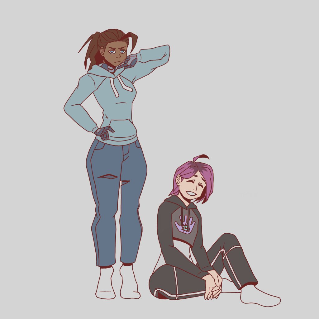
I was inspired to do another turn around drawing after reflecting on my last drawing of Tesal. It was a bit exaggerated (mostly the hair) but I was fine with that for the sake of the silhouette. It differs quite a bit from what I considered to be her canon design. Point is, the more videos I watch about character design and the more I think about how different people look in real life, the more I realise that exaggerating in character design makes a lot of sense even when you want to be grounded in reality. I think I was sticking too much to physically possible design choices and sacrificing character design for it.
So what does this have to do with Jolene’s third redesign? Well after I decided that Techwear Tesal was the canon representation of the character, I thought more about the silhouette that Jolene had and felt that it might need some refreshing. I didn’t realise how right I was until I tweaked her hairstyle and grabbed reference of goth girl drawings. One prime example of me deviating from reality here is the way I coloured her hair. The darker portion is her natural hair colour and the pink is the dyed hair growing out. This would normally be shown by a gradient but I thought it would look cooler if her hair was separated into two sections; and I was RIGHT. This version of Jolene is so many leagues better than the old one that I find it hard to believe I actually drew this. I’ll show you what the old and new look like side by side.
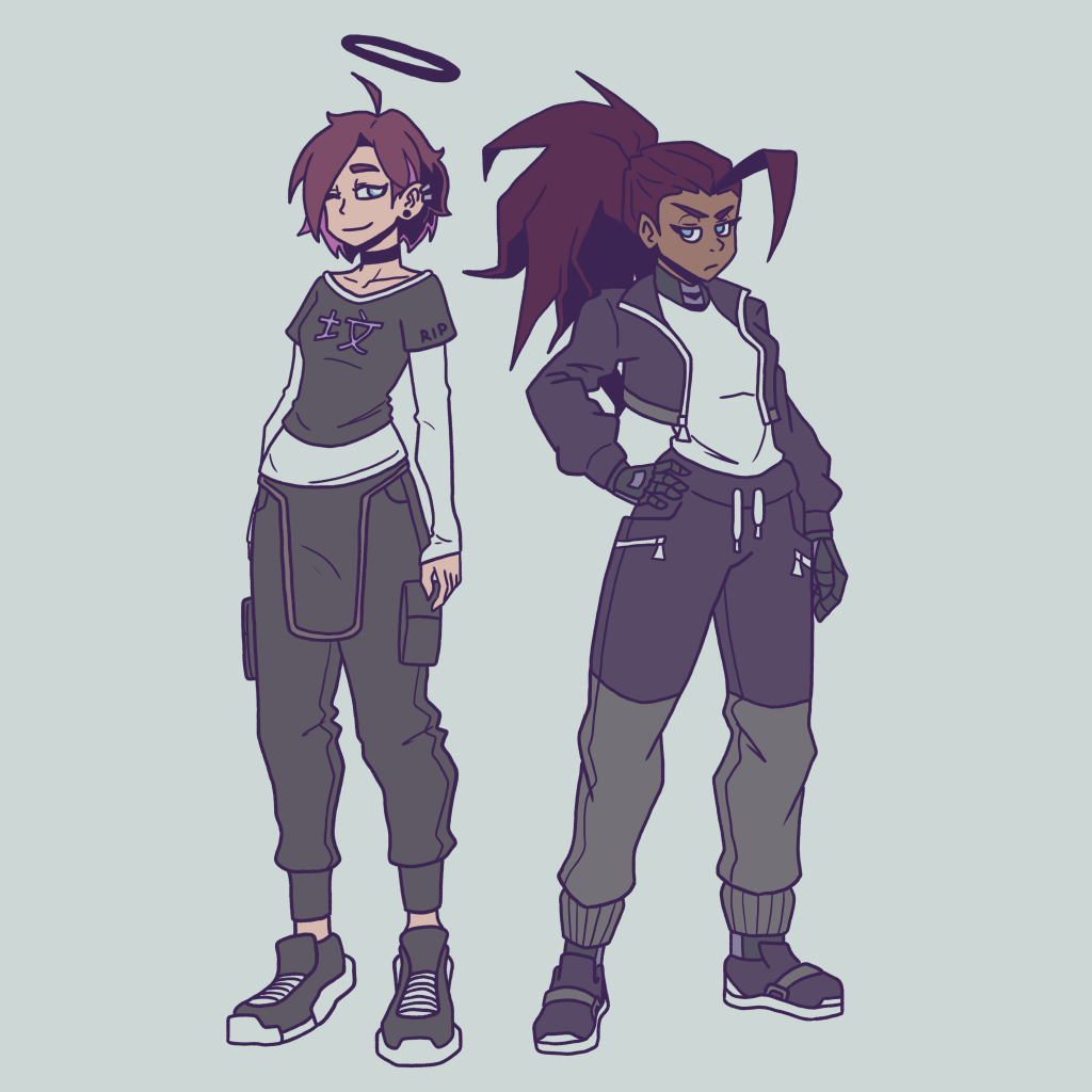
Really satisfying to have these two standing back to back, I’ve gotta say. Makes me wanna get back to writing the sequel to The Eyes of Jolene.
