

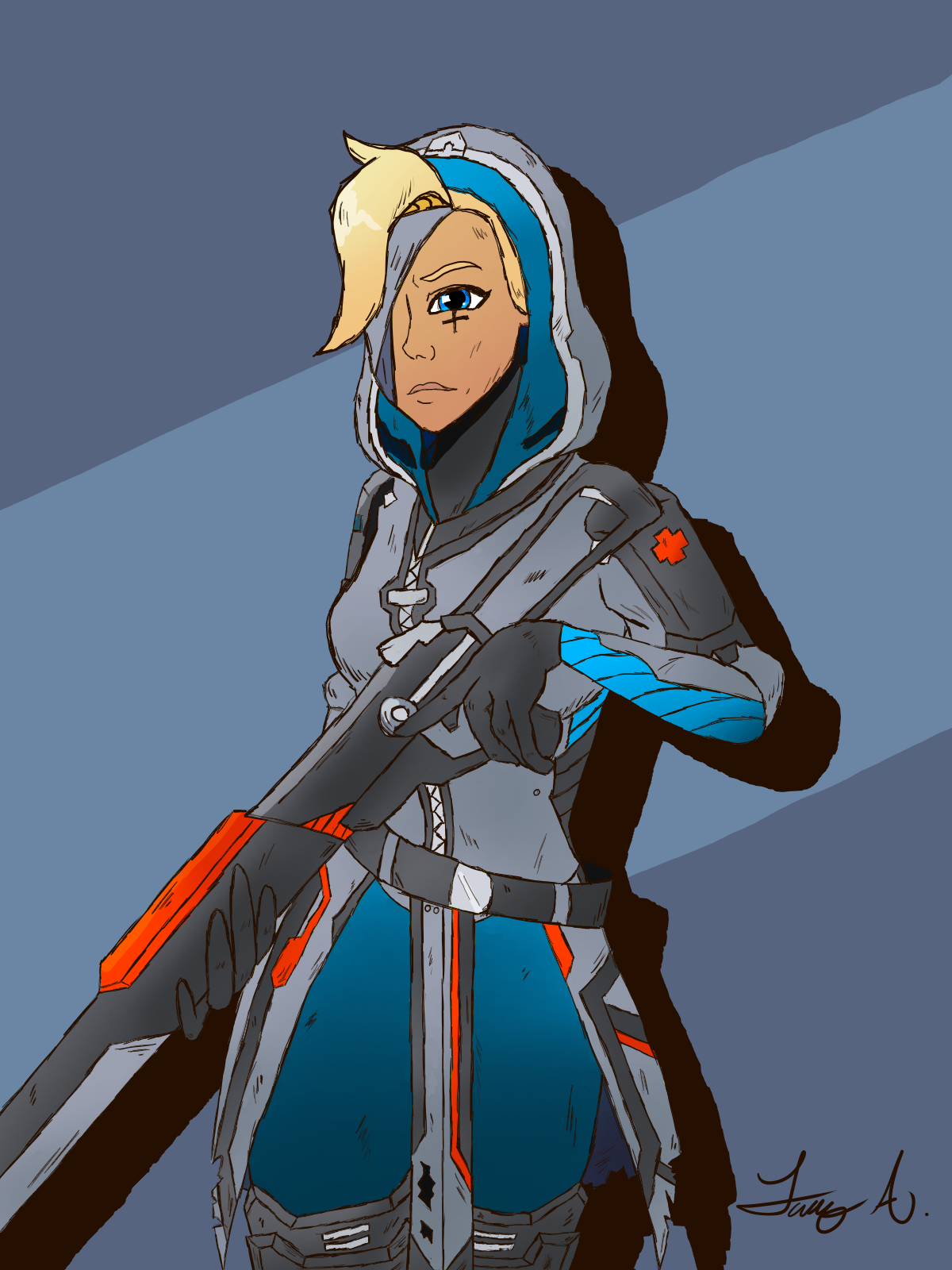
Time for a bit of colour theory. You might notice that this drawing is much easier on the eyes. It’s because the hood is now blue. Originally, my artist’s instinct allowed me to dictate how the colours would be used in a reasonable fashion, but my stubbornness to make sure Mercy’s aspects weren’t orange and Ana’s aspects weren’t blue kept me from changing the hood colour. I knew it wasn’t right. But I was very stubborn.
I did end up watching an extended video on colour theory last night for no apparent reason though, and found that my gut feelings weren’t unfounded. The scheme that I was using here was sort of complimentary, with the blue and orange. With that sort of scheme, the stronger colour of the two should be used less often (in this case, orange).
Allowing the orange to be used more like an accent allowed this drawing to be much easier on the eyes, which I’m grateful for. Next time, I’ll just try not to be so stubborn.
